Task 1
Historic Art Movements
In the 14th century Italy went through what is known as the Renaissance, and during this era cultural subjects such as art and architecture were focused on resulting in artwork to be produced. Michelangelo, Leonardo da Vinci and Raphael had inspiration from common pieces of classic art originating in Rome and Greece having interests in balance, naturalism and perspective. The result was anatomically correct sculpture in organic work and symmetrical in architectural work as well as being harmonious.

Mona Lisa
By Leonardo da Vinci
After the 17th century Baroque artwork emerged as a version of Renaissance that was more emphasised and extravagant. Senses of theatricality were established through dynamic contours and intricate drapery, treatment of light and depiction of movement created drama while architecture involved ornaments, carvings and imposing columns.

The Descent from the Cross
By Peter Paul Rubens.
Realism was popular in France mid 18th century and appeared as a direct rejection of Romanticism for it’s emphasised inspiration and subjectivity. Realism was the inverse of Romanticism as it was all about portraying everyday life instead. Realism gave people an insight into lower social class lifestyle and some social issues that came due to the Industrial Revolution. With cameras as a new competing technology many artists decided to take on Realism to achieve the most realistic work ever.

The Shepherdess
By William-Adolphe Bouguereau
Impressionism was distant from realism in that it used vibrant colours with little mixing as well as clear brushstrokes and open compositions to capture emotion through lighting. It was seen in the late 18th century most.

Impression, Sunrise
By Claude Monet
Post-Impressionism broke natural light and movement effects seen in Realism or Impressionism and was a style that was known for being abstract however what was defined as Post-Impressionism was broad in general.

The Starry Night
By Vincent Van Gogh
Surrealism is about the imagination and almost dream like art style, it allowed total freedom by breaking the bounds of reality which sometimes lead to realistic looking pieces which had completely unrealistic concepts.

The Persistence of Memory
By Salvador Dalí
Pop-Art is colourful and could be interpreted as a representation of what it was like to be hallucinating from the drug LCD in about the 1950’s. It became an art movement later in New York and it uses images of celebrities, popular drinks or other well known commercial items. Artists such as Andy Warhole and Roy Lichenstein used the commercial world in their work.

Crying Girl (1964)
By Roy Lichtenstein
Artwork Genre
Sometimes certain genres can be represented well through a specific art-form. The first example that comes to mind is that using dark and gloomy themes will represent how a horror game may look, game artists might use styles from surreal artwork to mutate reality and bend it in a creepy way. You can find surreal styles in games such as in the Silent Hill series where many of its monsters appear mutated and deformed against reality. I can also visualise baroque styles using the deception of light to influence drama, as a large amount of baroque work was drawn for depictions of religious and evil beings I think it may work in settings to do with corrupt religion or satanism, perhaps in games like Outlast.


Concept artwork of the Silent Hill monster “Closer”
By Masahiro Ito
Aside from horror, there are other genres that have common representation through a certain medium of art. If we look at a few adventure games we can see they follow the guidelines of looking calm, they appear soft in colour and almost like a watercolour painting. With reference to screenshots of some adventure games below the game Journey looks like a tonal painting in browns and the scenic view in both make the player relax due to the grand outside landscapes that have the player escape reality.


LoZ: Breath of the wild (left) & Journey (right), both adventure games enticing exploration.
Breath of the wild can be calm but when the game becomes tense when the character starts to battle enemies the bright colours of the game become noticeable. Similarly, in most action games vibrant colours are used in scenes and character designs to exaggerate happiness and bright moments that the rush of fighting gives off to the player. Also, the general aesthetic of these action games stands out, almost like the style of pop art with all its bright colours.


Fortnite: Battle Royale (left) & Overwatch (right), both bright coloured action games.
Although some genres have themes and styles that commonly work for them, it is very common to find games that do not follow forward with those themes because if every game per genre looked the same they would not be as interesting. From looking at modern games you can find examples such as how Dark Souls has dark themes whilst being about action and adventure, yet it is not meant to be a calm journey. Doom is a sci-fi action game that plays at a fast pace but it is more realistic in graphics than it is colourful, these are just a couple of examples and I believe that genres are not bound to certain art-styles.


Dark Souls 3 (left) & Doom Eternal (right), both not so vibrant variations of action.
Part of Task 2 – Defining my Project Goals
Evaluating my Brief
My task is to develop a final artwork piece in the context of a video game, what this makes me think of, is producing either promotional art content for a video game or illustrating a certain cinematic scene or game-play screenshot. To make a good piece of promotional artwork I will need to understand a majority of art fundamentals such as the composition of my scenes so that a viewer will be able to connect with my artwork and look at where I want them to be looking on the piece using things like blank space and the flow of characters or props. For a game-play screenshot I may need less composition as a game view-port is always changing and inconsistent however a strong understanding in other fundamentals such as anatomy if I wanted to draw a game character or perspective if I was drawing something in a 3D world.
When I assess this brief I will have to look at it within individual small tasks and define what is realistically possible with my skill set. I bring this up because I am aware of my position as a beginner in drawing. Due to this position I believe it will be a challenge to master every fundamental of art and I may have to focus my work on one subject specifically.
Parameters for Art Development
From evaluating my brief I know that I must first and foremost identify how I can best learn to create my own art and appreciate others’ art effectively. For this brief I will set out to complete certain task that will help me to learn the techniques that I can combine when I come to create my final art piece.
So, I would like to have a final piece portraying what my game would look like to the player during game-play. I believe it is in my best interests to learn how to draw the human figure through the study of anatomy and gesture, as in my game-play screenshot I would like to show characters of my game and I need to be able to construct them well. Secondly, by painting watercolour landscapes I hope to develop my composition skills and colour theory knowledge while gaining the ability to create an environment that my game would be set in. Thirdly, and Finally, I want to use acrylic paints to create portraits so that I can detail my characters and learn how to render things well using colour and lighting.
Back to Task 1 – Processes of Developing Art
Different artists use different methodologies in order to produce their artwork for an industry employer and each are good in different ways. Some techniques would be known by artists as a foundation to drawing and others are unique to a person who has discovered it through their own practise.
As the focus of my task is to produce concept artwork for a game I have researched into conceptualisation ideas and how to get ideas down fast and effectively. It is important when sketching out a concept for a game to not “work in lines” but instead “work in shapes” and use rough lines to create silhouettes. If you spend time trying to refine every line into correct form and shape it will take longer than the necessary needed for a piece of concept artwork. Using rough lines allow you to draw out lots of ideas in a small space of time and in the industry it is better to provide more than one final piece of concept artwork because what you might think looks good others might not.
There are always different approaches to reaching the same outcome and when it comes to drawing heads you can use the method proposed by Andrew Loomis which is when you draw out the cranium mass and extend a jaw on the bottom with reference to the side planes of the head. It uses less construction lines that the alternative Reilly method which has reference to the mass of the face divided into sections and from each new line you draw onto the face more points of reference are made for more lines.
I learnt about how works of concept art require areas of rest and areas of detail to add balance to the overall look. For example in the image below red represents large areas of rest, blue represents detail and takes the users attention to concentrate, while finally green is in the middle of both extremes.

Screenshot of someones work where they display how they have different sized areas on their work.
By Kienan Lafferty
Adding values is another important thing because it allows characters to stand out from the background, tell story and add light. Values are the shades of grey or tones in-between line-art, when using colour in images first try to think how light may affect the image and what you want to viewer to look at. In the example below the artist wants the viewer to look at the sword as it is bright and stands out from the rest.

Boy with glowing sword, showing the use of values to direct the audiences attention
By Kienan Lafferty
To draw inspiration for a piece of game concept artwork you can look at motifs which are types of patterns and try to apply them to a base structure of what you want to draw. If you are drawing clothes or weapons you could incorporate the pattern into the material design and shape and use the same curves or blocks of the motif to go to extreme edits on your work.
You can piece together character ideas using archetypes, tropes and some sort of spin and it can provide you with an initial starting point to go from. Sometimes you may want to pick at random from a list of classes, races and topics just to get an initial idea rolling. Otherwise, you could start with a template front pose of a character and block out the clothes you want them to wear, what hairstyle they should have and how to modify their silhouette in general to make them recognisable and easily repeatable.
When drawing the figure of a character you want to draw in solid 3D shapes like it was a wooden mannequin however when working at that level the body will not flow correctly. The 3D shapes should consist of cylinders for limbs with visible ellipses to show the cross-section and spheres for joints or the head but afterwards you can start to merge the objects together. By imagining the joints as if they were clay and blending them into the body you can start to develop muscle structure in your drawings to make them more realistic and feel natural. After being able to create ideal proportion bodies you can then work on bending the rules to suit your character design. Quite like the quote attributed to Pablo Picasso “Learn the rules like a pro, so you can break them like an artist”.
To make artwork believable you will have to deal with how the perspective of your viewpoint of drawing changes how the image is perceived. Using 1, 2 and 3 point perspective from a horizon line you can construct simple 3D shapes as bounding boxes to draw objects within and it helps to draw landscapes and buildings especially. The use of for-shortening which is when you warp objects depending on how close they are to the viewer. It will either compress or expand your drawing if it is further or closer to your viewpoint respectively.
Highlighting Differences
With the sheer capabilities of the growing online world, community sharing and discovering art is easier than it ever has been before. This has enabled me to view the processes of developing art from different artists’ perspectives and I have used many YouTube videos as a resource to develop my own learning.
When learning to draw the figure of the human body, from TheKNKLShow I found methods of drawing about constructing the body as a mannequin and converting that to what it would act like as though it flowed like clay. DrawWithJazza explains that when he constructs bodies he uses a skeletal mesh and adds flesh to it with rough lines to get an idea, then later redraws it more refined than before. I watched ArtByGalen to discover how he creates different parts of the body such as the face or arms while ProkoTV also showed me how to construct the face in a different way or learn about gesture and ways to use it as a foundation for your figure. Finally, RossDraws had content on how to design a character from scratch and briefly covered his processes too.
Task 2
Traditional and Digital Art
Artwork can be created in different mediums and the new split that comes from modern technology is between traditional and digital art. Traditional is unique because it captures the imperfections of the human hand and as it is in physical form the original copy will have more value than what a digital print or file can hold. In traditional artwork processes there is a broad range of equipment and materials to enable your creative talent through however because resources are tangible it can cost more because materials inevitably run out. It is difficult to reproduce physical artwork since colour can be lost or altered through scanning or photography.
On the other hand, digital artwork provides the ability to quickly and with risk-free methods manipulate your drawings to fix any perspective or proportional errors with ease. The undo button makes no stroke permanent and allows you to experiment to your heart’s content as well as the ability to save in iterations and copies. Another good thing is that once you have the equipment you will not have to purchase any more as unless the tech breaks or malfunctions, nothing gets used up. However, unlike traditional art there is no original copy as duplicates are indistinguishable from the first version and also it can become more technical than creative in some ways. Traditional art skills translate into digital work better than digital work translates into traditional artwork too because digital work simplifies things.
Justification for Others’ Concept Art


Other character concept artists such as Charlie Bowater in the images above do heavy study of the human anatomy as well as use less confident lines to create silhouettes for dynamic poses. You can also see that she uses similar poses to showcase different styles and overall clothing assumed to be pitched in a neat format.


Above, Luigi Lucarelli also produces variations of the same shape face but by creating different hairstyles and features makes the character seem like an entirely different character. Also, within his character design sheet he rotates the model so that it can be seen from different angles which would help future 3D modellers and riggers to work on it in the future.

Finally, in this Falmouth university student’s work, Arabella Collins, you can see a well developed character design sheet showcasing props and also the consideration of colour palettes. This would help identify a character by certain colours when seen in the game and help future roles such as texture artists do their work as closely to the concept.
Preliminary Artwork
Within my sketchbook and on Photoshop (Shown in my Digital Sketchbook below) I have sketches that show how I have developed my art skills from where I started with annotations to make my work presentable.
Video I used for reference in the creation of my Dagger prop. I took a liking to the Venetian 16th century Cinquedea style of sword because it is aesthetically pleasing and as it is short can be considered a dagger in some cases. The Cinquedea is also commented to practical in civilian hands when used in narrow alleyways against longer swords which fits the theme for a stealth game which is what I would like in this case.
Task 3
Developing Final Artwork
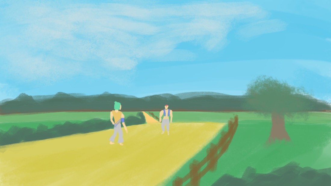
Artwork piece that shows I was naive and underestimated the skill needed to create a landscape.
Justification for Artwork Type
This artwork piece is a screenshot of game-play or cinematic scene. It would be used to advertise or portray what the game will look like to audience or potential investors. In the context of a game company where concept artists are employed it could be used to showcase the general idea of aesthetic but something like my weapon art concept sheet is better for showcasing my work.
The idea I wanted to express in my game was the water-coloured calm theme of the landscape, contradicted by the bright characters that stand out like pop-art inspired by Roy Lichenstein’s work. As I developed my character I wanted the game to be an adventure game with elements of stealth and quick, fast paced action. Therefore, as my research showed that adventure games use calm aesthetics in my final piece I opted for a watercolour landscape. Also because action games use bright colours that stand out I had the plan that when the game gets intense in certain game-play situations.
Evaluation of Artwork and Relation to Client
My focus on developing my own art skills over the duration of the course has been on figure and how concept artwork is thought out and presented to an employer. In my honest opinion I think that this piece does not reflect those skills as it shows a broad landscape of which my preliminary artwork on that subject only consists of a failed attempt at water-colouring. When I did try water-colouring I underestimated that the usage of colour tone by managing the amount of water and paint on your brush is an entire dimension of skill on it’s own.
The requirement of my client was to develop a final, finished piece of artwork and I have worked towards achieving this. When I was told this objective up I was thinking that what that meant was a polished piece of artwork involving colour and depth to showcase a scene in the game. What I should have instead done was to focus my specific media output on solely concept art, that way I could have used my focused skill in figure drawing to produce character design sheets at a professional standard.
Redemption of Work – New Final Piece

Click to view media file.
Task 4
Evaluation
Justification of New Artwork
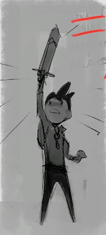
My final piece is a character design sheet for my game. In a game development company character design sheets are used to pitch ideas to the producer to decide what a game character will look like. On the right page I showcased the few iterations I drew to show the initial ideas of the character. Then, on the left page I included the figure and body of the character as well as a final idea for my character and weapon. I show the iterations because the final piece is a combination of different elements from them which I like the most and think most suited the character.
I used the method of values to lay a base for my character because as I researched concept artists do this to make certain elements of a character’s design stand out and they can represent a unique silhouette from it. I first lay down a base light grey value so that if I wanted to make things appear bright I could because the background supports that, for the cape and neck accessory I used a lighter value of grey than the background which makes them specifically catch the viewer’s eye.
With the initial figure having it’s chin up high while standing in a pose with all weight on one leg and casually resting the other, I wanted to make my character stand proud. To further enforce this I opted for the hair that gave off a pompous and grand appearance to show off emotion in my character.
Critical Analysis
A character design sheet is much more suited to the study of figure I had done for this project and so fits the brief as a final piece better than the landscape I did. My client requirements are a final artwork piece designed through iterations and this work shows that clearly. In my piece I drew a figure which was well proportioned, perhaps not so much on one of the legs which looks slightly skewed in one way. The layout is professional plus I gave a small description of my character and how he uses his blade in the game.
When looking at other character design sheets you may often see the characters being rotated to get a better view of them from different angles however mine only shows one pose from one angle. I did this because I struggled with creating dynamic poses to showcase him using the sword but also just transforming my work into 3D space felt difficult. The face detail is minimal and If I studied close detail more within the face there may have been a better output. As well as this I could have shown my character’s face in different expressions to help the viewer relate to the character more.
My work is also in complete grey-scale, one reason for this is because all reference that I used was in grey-scale however using a creative mind I would still have been able to colour my character and maybe even stylise him towards a pop-art Roy Lichtenstein style. During my whole project I had not used colour at all because I was focused on sketches and I believe this created a downfall here as I only represented my final character design in values. Overall I am still proud with producing my own character design sheet even though it may be lacking some common things.
Feedback and Relation to Precedent Artworks
From client feedback it was noted unfortunate that I did not show more of my prop design such as the sword process. I think this is interesting and that unfortunately under pressure of time I did not experiment with the sword as much as I wanted, I did do plenty of weapon conception however when I found the design of a Cinquedea I was not able to mess around with design fully by taking different hand guards, handles and playing around with the shape of the blade. It is still a satisfactory end result blade however it could have more creative inspired design work put into it.
The overall piece is inspired by concept artists in a few different ways, for example I have used one pose to pitch in a neat format and showcase different clothing and variations. I would have liked to also follow contemporary standards of showing a character from different angles or defining colour palettes however due to time constraints and lack of skill it has not happened.
